(There may be some research similar to that in my sequential module, but It makes sense as Im making similar products. I've made this research relate to this specific brief though.)
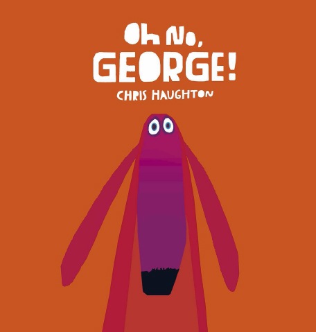
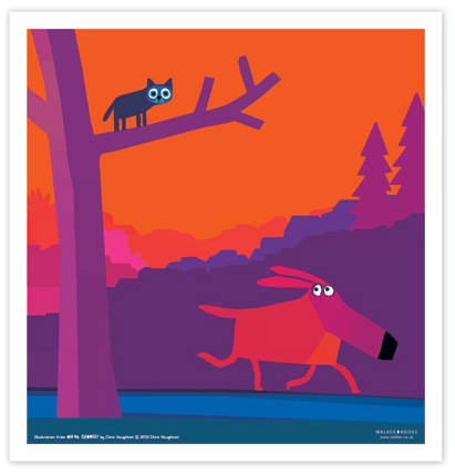
I found Chris Haughton's work during my sequential module and I still love it now and it still inspires me to create cute, colourful and wonderful illustrations. His work is so cute, the colours are bright and bold and the illustrations have a lovely collage feel, as if they were constructed by layers of torn paper. The palette definitely reinforces this idea, the colours looking like sugar paper, which gives it a nice primary school feel.
He uses hand rendered type in his works that also have this collage feel and it makes the text fit with the illustrations which is very important because when they done match, it can ruin the feel of the artwork.
I also love the simplistic shapes and compositions, the characters taking center stage among simply layered background that add a lot of depth thanks to a sensitive use of tone. The characters all seem to sit on a flat plain and it makes the illustrations look a bit like a puppet show or a play which is really appealing and somewhat naive, which is appealing to children. When illustration for a young audience you want to make it as easy for them to decode the image as possible, because they often cant read the writing so the illustration has to speak for itself. Keeping them simple but captivating is what Chris Haughton does best and it really works in his books.
THE CAT! LOOK AT HIS EYES!
I'd like to create stuff that looks this cute and I think with my use of colour It wont be too hard to do. I need to focus on the characters expressions and building a simple illustration that tells allot.


