Showing posts with label Inspiration. Show all posts

Endling

'Endling' is a fellow artist on DeviantART (don't know real name) that I have recently been following and have fallen in love with his illustrations. He has a great style that Is really suited to children's illustration but doesn't find itself restricted to that subject area at all. His work is very bright and colourful, with bold and expressive characters and scenes that would look great within a children.'s book but I don't think they have as of yet.

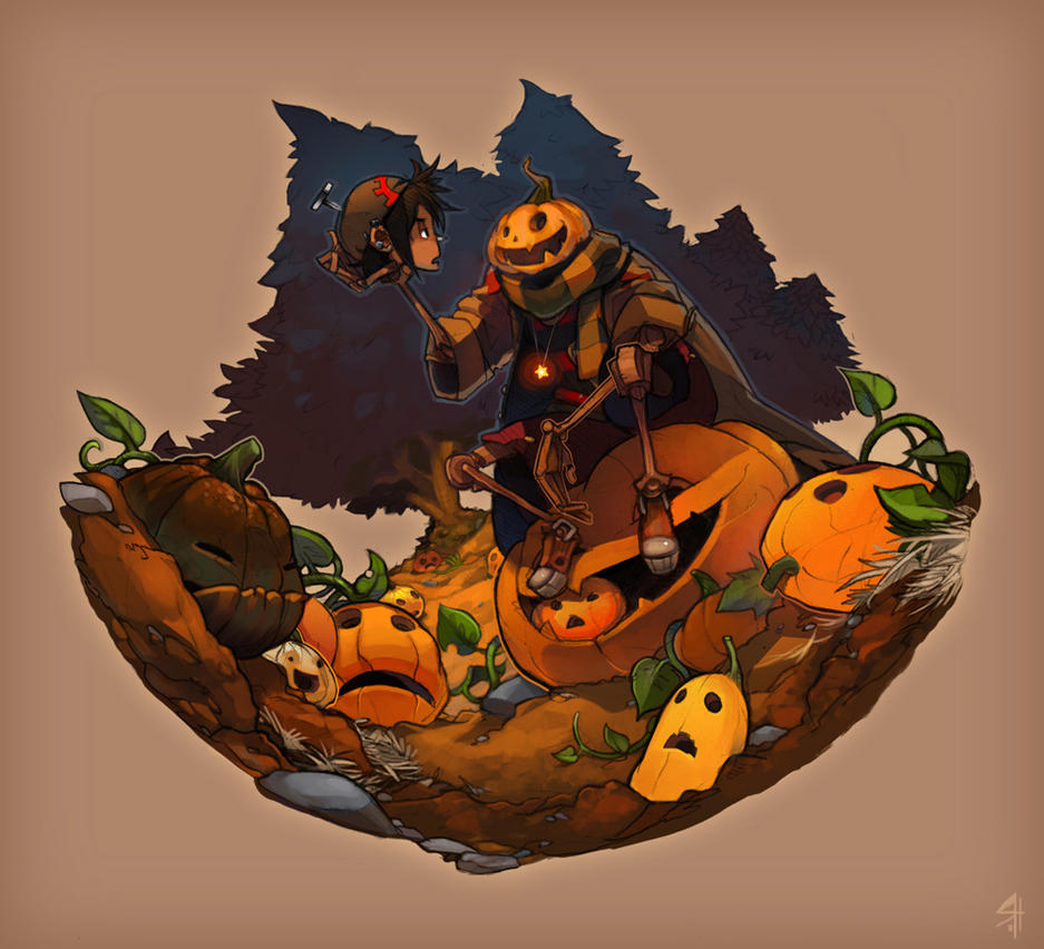
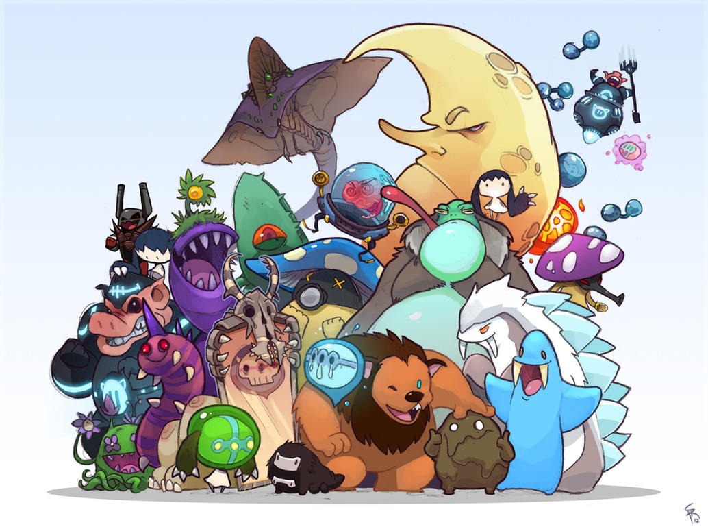
His characters are cute but also quite sinister at times which give them a more mature edge and makes them irresistible to me. The collection of monsters above it just wonderful, each little character has a life of their own and It is interesting how sometimes they are drawn quite differently but the coloring style brings them all together.
I love the soft shading style an his sensitivity to colour. The added elements of texture in some of the works elevate them and give another dimension.


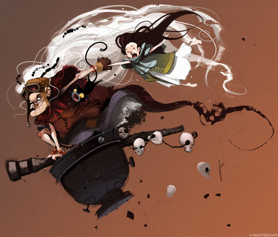
His work is a great source of inspiration for this book I want to make in particular because of his seemingly child friendly style that incorporates cute elements with the more sinister that helps me to gauge how far to take the detail and menacing nature of my monsters.
Id to get a more softer approach with my digital work like Endlings stuff, and think that It would work really well...

We will see...


Chris Haughton

(There may be some research similar to that in my sequential module, but It makes sense as Im making similar products. I've made this research relate to this specific brief though.)


I found Chris Haughton's work during my sequential module and I still love it now and it still inspires me to create cute, colourful and wonderful illustrations. His work is so cute, the colours are bright and bold and the illustrations have a lovely collage feel, as if they were constructed by layers of torn paper. The palette definitely reinforces this idea, the colours looking like sugar paper, which gives it a nice primary school feel. 


He uses hand rendered type in his works that also have this collage feel and it makes the text fit with the illustrations which is very important because when they done match, it can ruin the feel of the artwork. 
I also love the simplistic shapes and compositions, the characters taking center stage among simply layered background that add a lot of depth thanks to a sensitive use of tone. The characters all seem to sit on a flat plain and it makes the illustrations look a bit like a puppet show or a play which is really appealing and somewhat naive, which is appealing to children. When illustration for a young audience you want to make it as easy for them to decode the image as possible, because they often cant read the writing so the illustration has to speak for itself. Keeping them simple but captivating is what Chris Haughton does best and it really works in his books. 
THE CAT! LOOK AT HIS EYES!

I'd like to create stuff that looks this cute and I think with my use of colour It wont be too hard to do. I need to focus on the characters expressions and building a simple illustration that tells allot. 


Tom Gauld- The Hairy Monster

Grrrr...


I really like this concertina book by Tom Gauld, and it helps to give an idea of the layout I want for my little books. I like the way the monster shape is repeated throughout the book with microscope looking diagram on every other page. I really like the boldness of the illustrations and the lack of words, although really this doesn't need words at all. 
The restricted black and white palette keeps the illustrations consistent and hides some of the slightly grotesq artworks that it could be if another colour (red) was used. It hides that fact that it shows the monsters insides, which would be a bit macabre if coloured red or pink for example.
However, the dark palette wouldn't really work very well for something aimed at children but then I don't think this is. Still the cuteness of the character would appeal to a young audience. 

This peice works well as a sequential illustration with some sort of basic narrative but works well as a collection of artwork, like a mini gallery which is a really nice idea and makes the concertina book much more of a desirable and 'keep-able' object. A narrative for something like this isn't always essential and in someways without it the piece can feel more like an 'artists book' than a storybook. 

My intial idea for my book was to have several illustrations of different monsters wearing hats, and not have a narrative but not I'm not so sure If I want a narrative or not. It works well either way and it really depends on whether I want to expand on my narrative skills or just focus on the artwork themselves and let them do the talking.

In the brief It does say to take risks and perhaps do something that will push me, and I think I'm quite bad at coming up with stories and writing so this could maybe help work on that aspect? 


Inspiration- Bethany Strohm

This is another cut out concertina book that is similar to the previous one but dosen't necessarily tell a story. The book features cut out illustrations of 'Night Beasts' in woodland scenes and the pages cane be viewed together to create complete scenes and the illusion of a dense forest.


I like the way it is all black and how it fits with the Night beast theme. It looks really sophisticated and has a nice shadow puppet feel. You could spend ages looking through the individual cut out illustrations and I think people would really enjoy the work. 


It is packaged up really nicely and looks like a proper book and even when just open like in the picture above, it looks lovely and a complete work on its own, then opening up the book and seeing all the individual pages would be a delight. 
I don't want to make something this intense in terms of paper cut-out, but I do want to ake something that looks great as singular pages and great all together. It also shows that a single narrative dosent have to flow throughout the book, and that sometimes a collection of similar illustrations looks just as nice as a story.
I think the battle in my head between a sequential narrative and separate but uniform illustrations is going to rage on... 


Inspiration- Hiroko Matshushita

This is an amazingly beautiful concertina book that tells a fairy tale through ingenious paper cut-outs and paper engineering, created by Hiroko Matshushita.

The whole piece tells a story without words, using a black and white palette mostly made up of white cut-out shapes and minimal character illustrations. The mirror scene is particularly ingenious, when folded the queen character looks as if she is actually looking through a mirror at her reflection, but it is only a cut out mirror placed so that the illustrations face each other. Its very clever indeed.


This mirror thing is so clever!


The illustrations are simple and work with the blank backgrounds created by layered paper and cut outs, and they create depth naturally and make the little scenes come to life. 


This very much feels a one off piece of work but It could be produced on a limited scale quite easily because of the limited colour palette and could be cut out using a cutting machine. It would be highly desirable and as it tells a story in itself it works well as a storybook and a piece of art.


I'm really sold on adding some paper cut-out or layering elements and I might not go as far as this because its highly intensive and would only be good for a very limited production. I also like to sue a lot of colour and I dont think full colour would work as well for something like this.
This example helped to show how you can create a whole narrative with only a few pages on a concertina book and how lovely it can look. I'd love to retell a fairytale in this format! 


Inspiration- Esla Mora


I had a hard time coming up with an idea for my product for Stage 2 of this module but managed to narrow it down to something book related. I hope to progress into the children's book publishing industry in the future so books seemed the right thing to do. Apart from that though, I had no idea how I was going to make something desirable and awesome, but also realistically achievable to sell at the shop during the summer show.
Making a whole book would take too long, and would end up being very expensive...
I also thought about making a zine like booklet, but even that can be fairly costly, and very time consuming when factoring in printing If i were to do it myself. 

Anyway, while looking for inspiration on the lovingly named f***yeah!bookarts site, (http://fuckyeahbookarts.tumblr.com/) I came across some really nice examples of concertina books by Elsa Mora that inspired my idea for my product. 


Elsa Mora is a multimedia artist who makes a variety of artwork ranging from paper cut, paintings or handmade books. These handmade books are what inspired me the most. The one above is really lovely and shows a little paper cut-out scene hiding in a tiny book. It looks really desirable and this kind of thing would snap up well in a shop I think because they would so well as stand alone art pieces.
The cut-out elements make it stand out and feel much more special and unique. It feels very much like a one off because of this which adds to the desirability. 


The packaging for the above book, many little boxes inside other boxes and covers. It feels really special and id expect to pay allot of money for this, factoring time and materials.


This is another cut out example that when the pages are folded up, creates a scene. I love the simplicity of the design and you only really notice the insane detail when you look closely. The cut out scenes are really beautiful and work so well together.
This kind of think couldn't be mass produced without same cutting machinery and at this scale it would be very delicate, so again this feels like a one off. 
Although I would like to add some 3d/papercut element to my product because it really adds something to a piece of artwork, I have to be aware of the amount of work I want to be doing and the quality of the finished products. 


This is very simple but really nice. It shows how the format of the concertina book works really well for sequential illustration aswell as stand alone illustrations that come together through the medium.
Im sold on the concertina book idea already.