Concertina books on Etsy


£19.05
http://www.etsy.com/listing/98605353/concertina-book-in-gift-box 
11 pages, hard bound with accompanying box. 


£4.25
http://www.etsy.com/listing/70288600/concertina-book-zine-five 
5 pages B&W with evelope.


£15.24
http://www.etsy.com/listing/45192365/calligraphy-quote-book-each-of-us-owes
7 pages, hard bound, hand written book. 


£12.39
http://www.etsy.com/listing/70082800/hand-made-art-book-the-garden
21 page, colour, hard bound.


£12.85
http://www.etsy.com/listing/83492652/a-mini-print-exhibition-artists-book 
 8 page, colour, no binding.


 £3.18
http://www.etsy.com/listing/99438549/a-little-book-of-pictures 
20 pages, black and sepia, no bind. 

A few examples of conertina book son Etsy and their price range. There is a big different between some of theses, and it makes its really hard to price my books. The 20 page on just above is very cheap compared to the 6 or so page one just above it. 
Obviously the hard bound ones are a lot more, but even still I think some of them are way to expensive.


Luigi Lucarelli


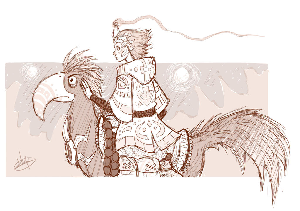
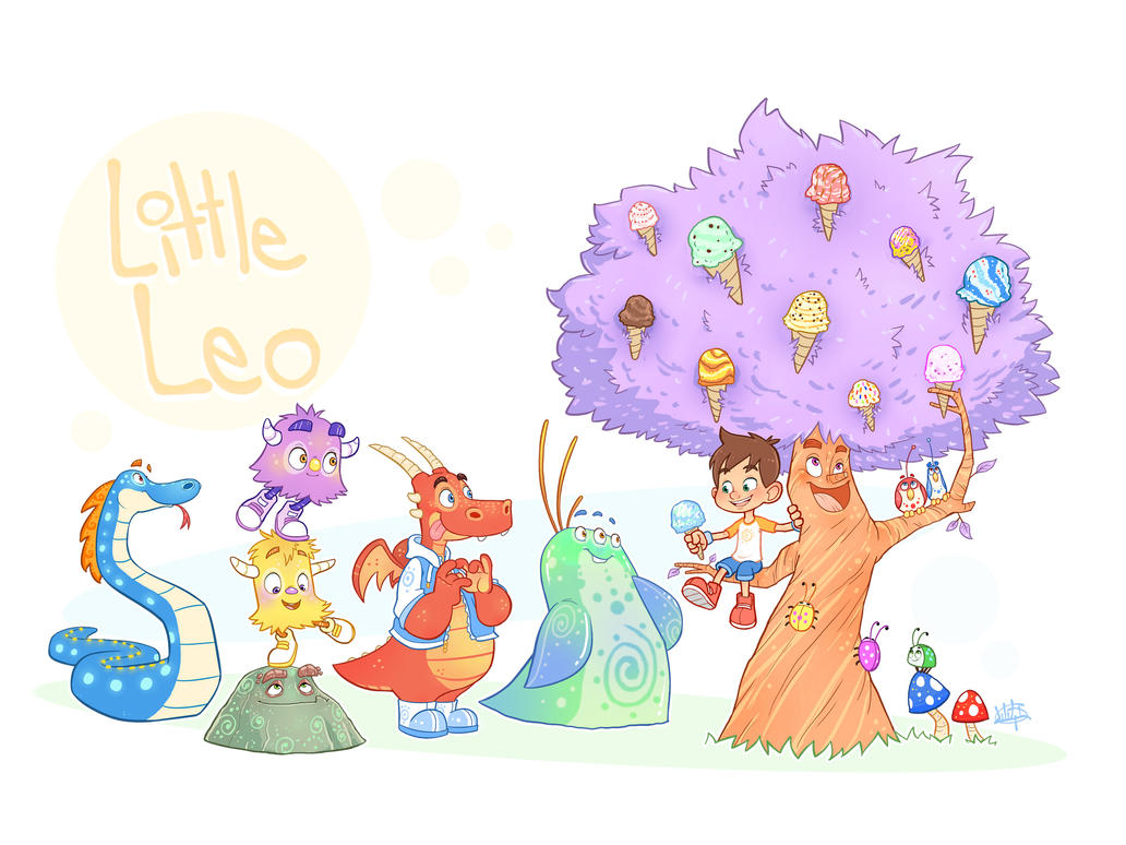
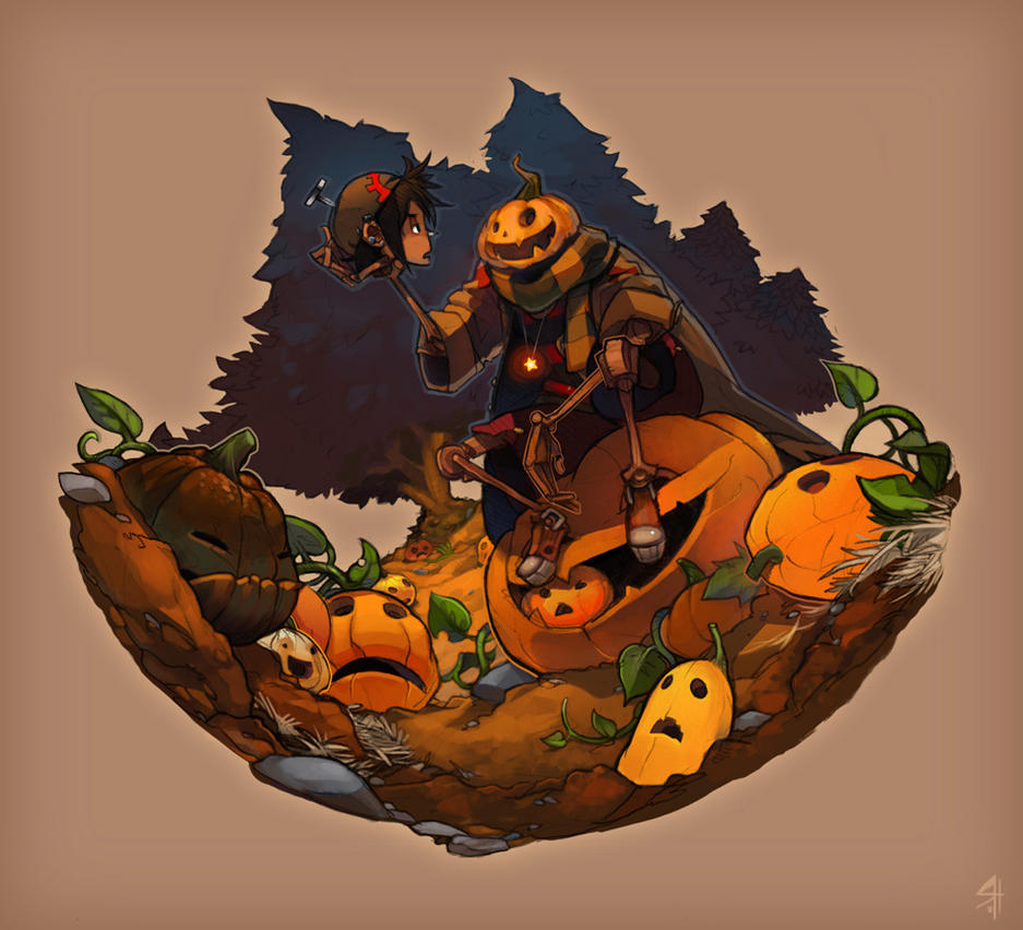
Luigi Lucarelli is another artist I found on DeviantART and I really love his work too. He focuses on character design and is known for his creative and imitative designs. He sticks to digital mediums, relying on pencil like mark making (produced digitally) and applies bright and bold colors.

His character development is what really inspires me though. They are so expressive and so individual, each character he draws is telling their own little narrative which is open to the audience to decifer. This is very close to what I want to achieve with my illustrations, but leaving little narrative clues to encourage the audience to make up their own minds on what is going on.

This one above for example has some subtly comedy implied by the bird expression. His stark stare is coupled with the serene but alert expression on the female character and it makes the scene really humorous. Who knows what the bird has seen in the distance? And are we intended to be the one the girl is looking to the side at? This kind of interaction is really fun for an audience and is something I hope to include in my monster book.


Endling

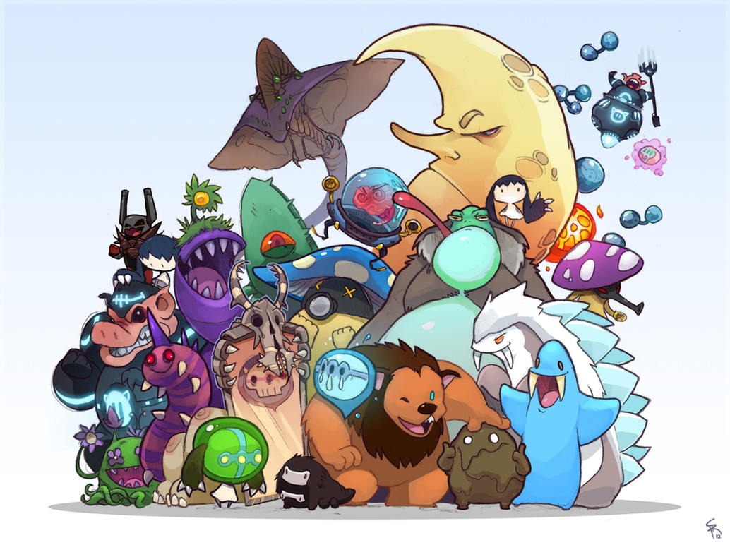
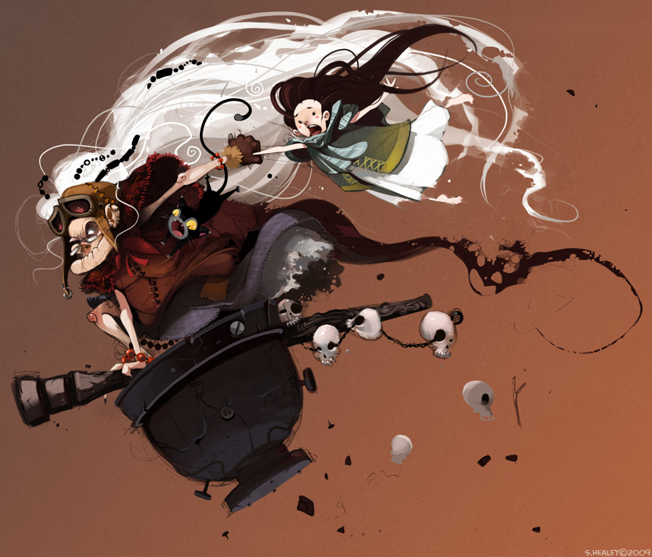
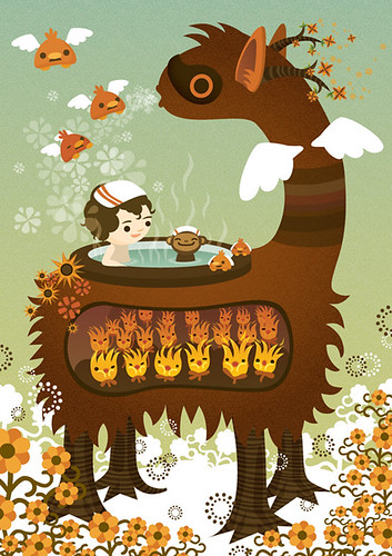
'Endling' is a fellow artist on DeviantART (don't know real name) that I have recently been following and have fallen in love with his illustrations. He has a great style that Is really suited to children's illustration but doesn't find itself restricted to that subject area at all. His work is very bright and colourful, with bold and expressive characters and scenes that would look great within a children.'s book but I don't think they have as of yet.

His characters are cute but also quite sinister at times which give them a more mature edge and makes them irresistible to me. The collection of monsters above it just wonderful, each little character has a life of their own and It is interesting how sometimes they are drawn quite differently but the coloring style brings them all together.
I love the soft shading style an his sensitivity to colour. The added elements of texture in some of the works elevate them and give another dimension.


His work is a great source of inspiration for this book I want to make in particular because of his seemingly child friendly style that incorporates cute elements with the more sinister that helps me to gauge how far to take the detail and menacing nature of my monsters.
Id to get a more softer approach with my digital work like Endlings stuff, and think that It would work really well...

We will see...


Tony DiTerlizzi

When design the monsters for the book, my designs shifted a little from trying to be really cute (like meomi style) to something a little more mature, focusing on making the monsters look really cool and incorporating details to make the illustrations more appealing.
Very initial designs started off being very cute and basic, inspired by my previous research but as I started to look for inspiration for more creative character designs my area of research grew, and my monsters matured a little..


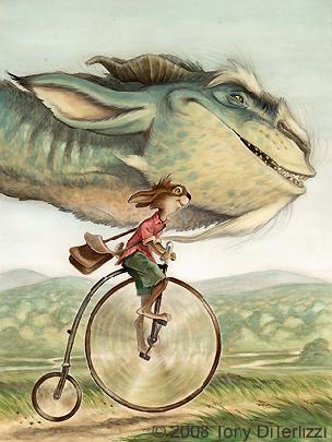
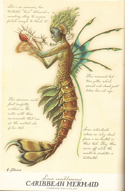
Ive enjoyed Tony DiTerlizzi's work for a very long time and ever since I bought 'The Spiderwick Field-guide to fantastic world around you' Ive wanted to create something similar, or at least along those lines.
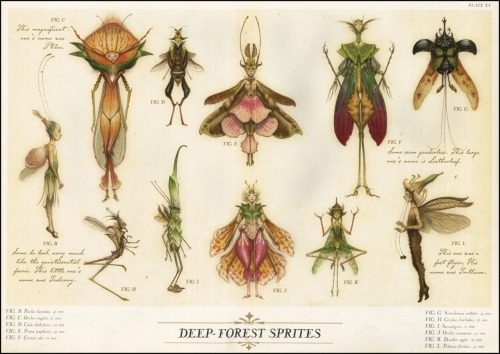
The book is a fantasy bestiary that explains the creatures that feature within the Spiderwick series of books (and also a film) and includes beautiful illustrations of fantasy creatures and beings along with in depth descriptions of their behavior and things like that. The book is fantastic in every way and DiTerlizzi's illustrations make it what it is.

He has a wonderful style that bring these otherworldly creatures to life, the Expression in their faces and the detail is lovely. He uses alot of watercolour in his work, coupled with sketchy line work that adds texture and form to the illustrations. The subtle tones of the watercolour make the sense almost dreamlike and allow for alot a detail to show through from the pencil lines and mark making underneath. 


Some of the illustrations with the Spiderwick Field-guide are vignette like and some take up a whole page, incorporating simple but lush backdrops that make the monsters feel at home. The few images show the kind of thing that can be seen within the book.
 His work is much more detailed than the kinds of things in my earlier research and I don't think I want to go into this much depth with my illustrations (I dont even think I could) but its gives a good idea of how monsters and the like aren't just for young children, and with enough detail and character, they can appeal to a wide audience.

I hope to capture some of the life that he injects into his work and give them same level of care over my character designs and the way I render them. My designs are and will be more stylized and less life like than these because my work tends to lean towards a cute style suited for children's illustrations but it dosen't mean the monsters will be any less expressive and interesting as these... I hope anyway!


Kate Slater


I came across the work of Kate Slater whilst looking for ideas and inspiration for the layered elements of my illustrations. Her work is absolutely amazing and although the layered work is what attracted me, her flat work is still just as wonderful. Collage features heavily in her work and she combines textures and colour to create lovely little collaged characters that often make their way into 3d compositions in the end.
She is very good with colour, each chosen material has the right tone and texture to make the illustration fit and come to life. Collage can be a hard thing to do right, but these works are really well done.
Her drawing style comes through with the collage exceptionally well and helps to show off the cuteness of them. 


Her 3d layered scenes are amazing, the characters are constructed with the same collage techniques of her flat work and then the background and scenery are also made out of collage. She makes up the scenes as a stage play, layering the props over the backdrop and then the characters over that. She makes a wire frame above the backdrop that hold the characters and props suspended in front of the background, and then photographs the whole thing to create these beautiful illustrations.
I just love these illustrations so much, and already having experimented with layering in my work Id love to have a go at this 'extreme' form of it. I don't think I will include collage in my work but the layering and photographing could really work well, and make the illustrations in my book feel really special.


Anna Barrett


CAT PUTTING ON SOCKS! 
Anna Barrett is another illustrator that uses this watercolour painted style with panted outlines much like Scott Campbell, but she also uses digital mediums with a similarly watercolour effect. The cat above is
a really good example of the outline thing that seems to be happening allot in illustration and I really love it!
I like to use watercolour in my work aside from the digital and I normally use fineliner pens to create the linework, but using painted linework really makes the illustration come together and the lines don't distract from the actual work. 
I will experiment with this technique...

Her digital work has the same watercolour-ey feel thanks to added textures and soft shading style. The colours are subtle and work well together in her illustrations, mostly having a brown tinge which are again due to the textures but which create a nice harmony.
She never really uses in depth background in her work if at all, because her work mostly focuses on character designs. The lack of background helps us to focus on the characters and will be something I have to think about when doing my book and thinking of the layout.


Elys Dolan


I came across Elys Dolan's work during the Waterstone's 'Picture This' competitions last year that I was
going to enter,  which involved creating character designs and a double page spread of Beauty and the Beast.  I was instantly drawn to their work because of the wonderfully cute and eccentric characters and her very child friendly style.
Her work has subtle colours that give off a really lovely dream like feel and appear to be created digitally but also look somewhat traditional, as if rendered with colouring pencils. This has a slight naivety about it which works really well with children's book illustration. 


Her characters all have huge eyes, which give allot of character and expression and makes the character look super cute, I feel some of the designs could fell more mature if it weren't for the over the top style. This super cute thing is really important when aiming at a young market but it also appeals to a wider audience particular a female audience who maybe more inclined to cute sugar-coated goodness.I want to appeal to this kind of market but also don't want to restrict my audience so I have to have a balance between super cute and 'AWESOME'..


Still, I really love this work and the character designs, as well as the soft rendering style. I think during my character design process my characters had gone a little mature in terms of detail and 'realism' so maybe drawing back on some of the detail and exaggerating the proportions will help make it more like and children's book illustration. 


Meomi!


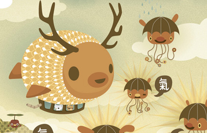
I also briefly looked at the work of Meomi during my sequential module but I believe I can draw upon the work again because of the insanely cute artwork. My concertina book will revolve around cute little monsters wearing hats (or something like that anyway) and so what better inspiration than this! The characters are adorable!
It also works with my goal to make people smile with my work, as one cannot fail but smile when looking at Meomi's work. I'm a fan of The Octonauts (as im sure most people are secretly) mostly just because it makes me smile, and Id love to capture that in my illustrations.


Rainbow rain...


The artwork is all digital vector style, with no linework. Coupled with a sensitive and refined colour palette, the illustrations are really subtle and look simple yet in fact they aren't at all, the detail in some of the works is immense.
I think the cuteness is thanks to the large proportions on the characters (massive heads for example) and the simple expressions, the illustrations speak for themselves.


Chris Haughton

(There may be some research similar to that in my sequential module, but It makes sense as Im making similar products. I've made this research relate to this specific brief though.)


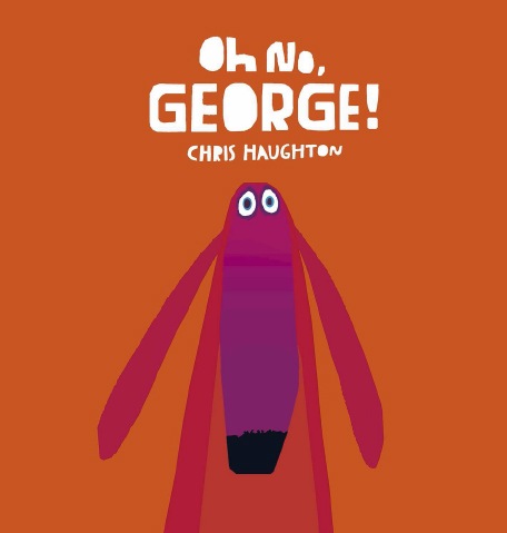
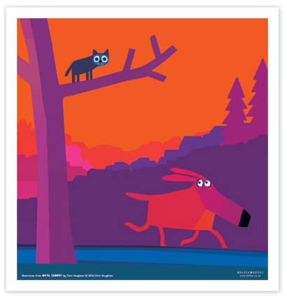
I found Chris Haughton's work during my sequential module and I still love it now and it still inspires me to create cute, colourful and wonderful illustrations. His work is so cute, the colours are bright and bold and the illustrations have a lovely collage feel, as if they were constructed by layers of torn paper. The palette definitely reinforces this idea, the colours looking like sugar paper, which gives it a nice primary school feel. 


He uses hand rendered type in his works that also have this collage feel and it makes the text fit with the illustrations which is very important because when they done match, it can ruin the feel of the artwork. 
I also love the simplistic shapes and compositions, the characters taking center stage among simply layered background that add a lot of depth thanks to a sensitive use of tone. The characters all seem to sit on a flat plain and it makes the illustrations look a bit like a puppet show or a play which is really appealing and somewhat naive, which is appealing to children. When illustration for a young audience you want to make it as easy for them to decode the image as possible, because they often cant read the writing so the illustration has to speak for itself. Keeping them simple but captivating is what Chris Haughton does best and it really works in his books. 
THE CAT! LOOK AT HIS EYES!

I'd like to create stuff that looks this cute and I think with my use of colour It wont be too hard to do. I need to focus on the characters expressions and building a simple illustration that tells allot. 


Tom Gauld- The Hairy Monster

Grrrr...


I really like this concertina book by Tom Gauld, and it helps to give an idea of the layout I want for my little books. I like the way the monster shape is repeated throughout the book with microscope looking diagram on every other page. I really like the boldness of the illustrations and the lack of words, although really this doesn't need words at all. 
The restricted black and white palette keeps the illustrations consistent and hides some of the slightly grotesq artworks that it could be if another colour (red) was used. It hides that fact that it shows the monsters insides, which would be a bit macabre if coloured red or pink for example.
However, the dark palette wouldn't really work very well for something aimed at children but then I don't think this is. Still the cuteness of the character would appeal to a young audience. 

This peice works well as a sequential illustration with some sort of basic narrative but works well as a collection of artwork, like a mini gallery which is a really nice idea and makes the concertina book much more of a desirable and 'keep-able' object. A narrative for something like this isn't always essential and in someways without it the piece can feel more like an 'artists book' than a storybook. 

My intial idea for my book was to have several illustrations of different monsters wearing hats, and not have a narrative but not I'm not so sure If I want a narrative or not. It works well either way and it really depends on whether I want to expand on my narrative skills or just focus on the artwork themselves and let them do the talking.

In the brief It does say to take risks and perhaps do something that will push me, and I think I'm quite bad at coming up with stories and writing so this could maybe help work on that aspect? 


Scott Campbell

Scott Campbell is an illustrator I've followed for quite some time and I absolutely love his work! His book 'East Dragon West Dragon' inspired the idea to do 'Monsters with Hats' for my book. I love dragons and beasts (cute ones in particular) and thought it would be great to create a cute little story with monsters like Scott Campbell does. 
Anyway.. on to his work!


This is a spread from the for-mentioned book and it shows off his wonderful style. All his illustrations are created traditional with watercolour, layering up colour on top of the sketches (composed digitally and printed out) and adding a 'wobbly' watercolour line over the colours to give lovely soft linework which seems to make the characters even cuter.
He draws in quite a flat way with the characters sitting on relativity flat plains which makes the illustrations look very child friendly and almost puppet or play like.


His characters are insanely cute, including this zombie above and I think the watercolour adds to this cute feel, the subtle colours adding a delicateness. I really love this technique of only using watercolour and would love to give it ago. I use watercolour allot myself but often combine it with bold back outlines which add a very graphic feel, but I will love to experiment with this technique of drawing with the paint. 


I also love the simplicity of his compositions, often focusing on a few characters on plain backgrounds. It dosen't over compliment the illustrations even though when he dose incorporate background like the dragon picture, it still looks great. 

His work has really inspired me to experiment more with the way I paint and copose my images. Its also made me want to draw lots and lots of cute monsters so that they will take over the world!
Good job I'm making a book about cute monsters then! 


Alice Potter


A lovely little handmade/handbound book by textile designer and illustrator, Alice Potter. Shows that its very possible to make a proper looking book by hand even if it is in fact a concertina book like this is and that when packaged and bound properly they can look like a real book and look really professional. 
Obviously it would involve allot of work to do this for every copy of the book, (and expensive too which Id have to reflect in the price) but for the limited edition copies, It could be realistically done.


Concertina fold pages, bound by a think cover.


The illustrations are lovely inside and simple, but it really makes the book stand out. It reminds me allot of the work of Chris Haughton (which served as inspiration for her, according to her blog) with the bold contrasting colours and block screen-print like style. 
After experimenting with digital methods of creating a screenprint effect I would really like to try this for my illustrations, I think it adds a nice handmade touch. 


It looks so sweet! The little owl makes me smile in a way I hope to achieve with my illustration in my concertina book. It also appears that text is minimal and the book focuses on the illustrations which is nice because it would appeal to younger audiences because they can just enjoy the pictures. 


Elly Mackay

After my degree I want to progress into children's book illustration so it makes sense for my product for stage two to reflect this. So let's look at some awesome children's book illustrations to inspire my concertina book.


These are some lovely illustrations made up on some paper cut-outs, paper engineering and other multimedia elements that are then photographed as illustrations.
They are just BEAUTIFUL!
The characters are cute but still very representational and I think this is helped by the collage materials used that give it a bit more realism. The process of photographing the constructed paper scenes makes them feel allot more special than just a straight illustration and again, they feel more real.


The texture on the dress is wonderful!


The colours are subtle and beautiful and she employs lighting techniques to add mood and drama into the illustrations that I don't think you would get without this process. It would be great to give this a go and expand on what I've done already this year with experiments with paper engineering and layering. 


However, It wouldnt really work with what I have planned as the outcomes would be flat illustrations (I want to use layering in the illustrations themselves) but it does show what can be done with just paper and photography. 


Inspiration- Bethany Strohm

This is another cut out concertina book that is similar to the previous one but dosen't necessarily tell a story. The book features cut out illustrations of 'Night Beasts' in woodland scenes and the pages cane be viewed together to create complete scenes and the illusion of a dense forest.


I like the way it is all black and how it fits with the Night beast theme. It looks really sophisticated and has a nice shadow puppet feel. You could spend ages looking through the individual cut out illustrations and I think people would really enjoy the work. 


It is packaged up really nicely and looks like a proper book and even when just open like in the picture above, it looks lovely and a complete work on its own, then opening up the book and seeing all the individual pages would be a delight. 
I don't want to make something this intense in terms of paper cut-out, but I do want to ake something that looks great as singular pages and great all together. It also shows that a single narrative dosent have to flow throughout the book, and that sometimes a collection of similar illustrations looks just as nice as a story.
I think the battle in my head between a sequential narrative and separate but uniform illustrations is going to rage on... 


Inspiration- Hiroko Matshushita

This is an amazingly beautiful concertina book that tells a fairy tale through ingenious paper cut-outs and paper engineering, created by Hiroko Matshushita.

The whole piece tells a story without words, using a black and white palette mostly made up of white cut-out shapes and minimal character illustrations. The mirror scene is particularly ingenious, when folded the queen character looks as if she is actually looking through a mirror at her reflection, but it is only a cut out mirror placed so that the illustrations face each other. Its very clever indeed.


This mirror thing is so clever!


The illustrations are simple and work with the blank backgrounds created by layered paper and cut outs, and they create depth naturally and make the little scenes come to life. 


This very much feels a one off piece of work but It could be produced on a limited scale quite easily because of the limited colour palette and could be cut out using a cutting machine. It would be highly desirable and as it tells a story in itself it works well as a storybook and a piece of art.


I'm really sold on adding some paper cut-out or layering elements and I might not go as far as this because its highly intensive and would only be good for a very limited production. I also like to sue a lot of colour and I dont think full colour would work as well for something like this.
This example helped to show how you can create a whole narrative with only a few pages on a concertina book and how lovely it can look. I'd love to retell a fairytale in this format!